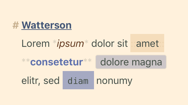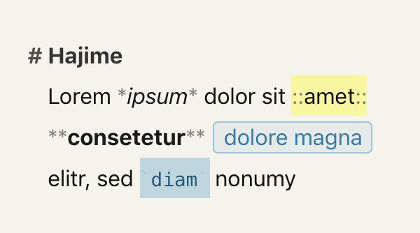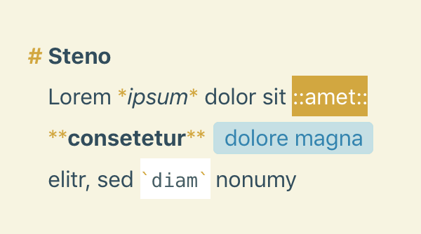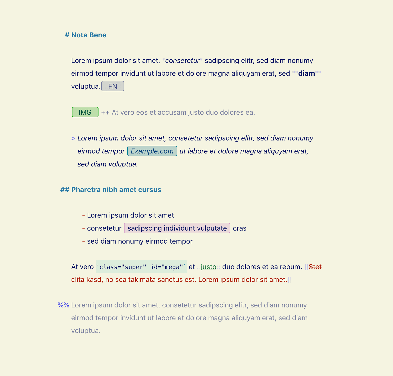
Nota Bene
By Watts Martin
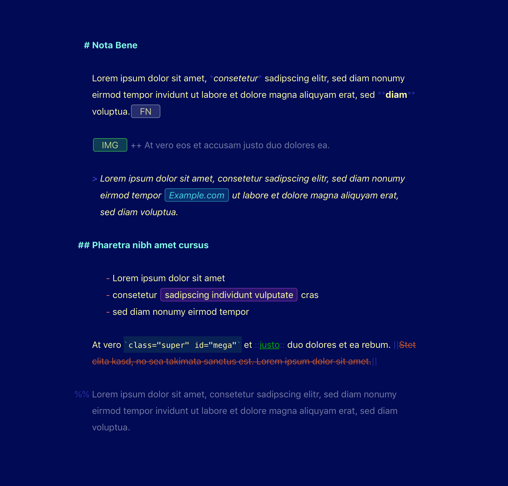
Nota Bene is designed to be comfortably subdued in both dark and light mode while having a little more character than "minimal" grayscale themes. Inline markup is subtle, but always visible, and all markup elements have been tweaked. The color set was inspired by an old word processor that shares its
Show MoreNota Bene is designed to be comfortably subdued in both dark and light mode while having a little more character than "minimal" grayscale themes. Inline markup is subtle, but always visible, and all markup elements have been tweaked. The color set was inspired by an old word processor that shares its name with the theme. Nota Bene looks excellent with a good typewriter face such as Matthew Butterick's Triplicate.
Show Less