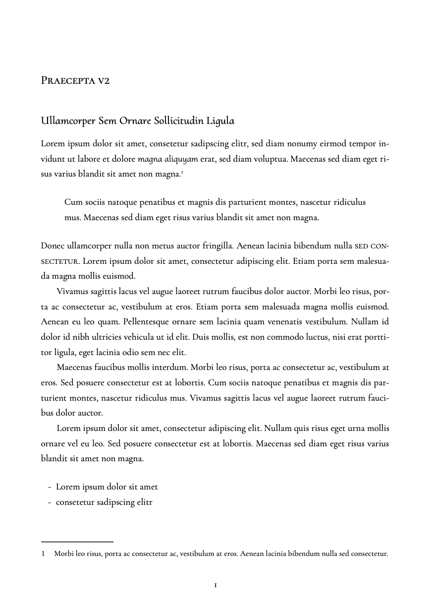
Praecepta v2
By ojuutilainen
A complete reimagination of the original Praecepta. This style uses Cormorant and its variant styles as the main font, and Inconsolata for the odd occasion that a fixed width font is needed.
Notable features:
- Justified alignment for body text
Show MoreA complete reimagination of the original Praecepta. This style uses Cormorant and its variant styles as the main font, and Inconsolata for the odd occasion that a fixed width font is needed.
Notable features:
- Justified alignment for body text
- Typefaces use Medium weight by default (Cormorant is a display font by design)
- Carefully styled headings down from h1 to h6 for diminishing emphasis:
#h1: Cormorant
##h2: Cormorant SC
###h3: Cormorant Upright
####h4: Cormorant SC
#####h5: Cormorant Upright
######h6: Cormorant Italic
- Copy: Cormorant Garamond (for added legibility)
- *Emphasis*: Cormorant Upright
- **Strong**: Cormorant SC
- Page numbering
- First level headings (single #, heading-1): section break.
- Single paragraph divider (----): a small gap between paragraphs
- Two dividers in sequence: an asterism (⁂) with a gap on top and below
- Three dividers: a page break after, one asterism visible before the page break